How to Getting Start to try Material Components in your project
I think some developers have problem for create some UI in application then Material Design help you for this.
Brief
Material Design has 3 big aspects which are Design, Developer, and Tools.
Material Components (MDC) help developers implement Material Design. Created by a team of engineers and UX designers at Google, MDC features dozens of beautiful and functional UI components and is available for Android, iOS, web and Flutter.
- Announce at Google IO’2014 on June 25, 2014
- Material Design can be used in all supported versions of Android, or in API Level 21 (Android 5.0) and newer (or for older via the v7 appcompat library)
- Expanding on the “card” motifs that debuted in Google Now
- Key materials in Material Design is paper surface which pieces of digital paper with digital ink.
Plaid is showcase for Material Application and put news and inspiration about design which create by Nick Butcher (Developer Advocate at Google) and his team
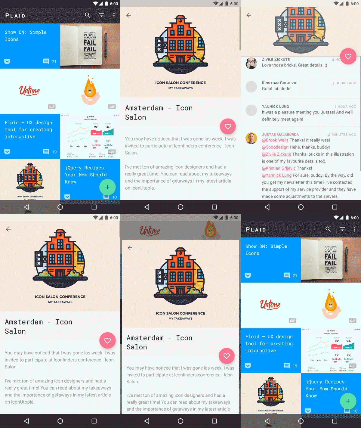
and you can read the source code in Github.
You can download it on Play Store but only for beta tester.
https://play.google.com/apps/testing/io.plaidapp
In Nick Butcher blog he said about Plaid 2.0 that started working at the beginning of June 2018 and moving to Architecture Components and Kotlin.

Getting Start
These are 5 important steps which according to Material Design Document
1. check build.gradle of module to android compileSdkVersion to 28 which compile your app with Android P
android {
    compileSdkVersion 28
    ...
}
2. Add Material Design Library in module level build.gradle
For AndroidX
implementation 'com.google.android.material:material:1.0.0'If you haven’t move your project to AndroidX, you can use Android Support Library as a dependency
implementation 'com.android.support:design:28.0.0'3. change your app theme to inherit from Material Components theme
<resources>

<!-- Base application theme. -->
    <style name="AppTheme" parent="Theme.MaterialComponents">
        <!-- Customize your theme here. -->
        <item name="colorPrimary">@color/colorPrimary</item>
        <item name="colorPrimaryDark">@color/colorPrimaryDark</item>
        <item name="colorAccent">@color/colorAccent</item>
    </style>

</resources>
This is list of Material Components themes
Theme.MaterialComponentsTheme.MaterialComponents.NoActionBarTheme.MaterialComponents.LightTheme.MaterialComponents.Light.NoActionBarTheme.MaterialComponents.Light.DarkActionBar
If you cannot change your theme to inherit from a Material Components theme, you can inherit from a Material Components Bridge theme which inherit from AppCompat themes and define the new Material Components theme attributes.
Theme.MaterialComponents.BridgeTheme.MaterialComponents.Light.BridgeTheme.MaterialComponents.NoActionBar.BridgeTheme.MaterialComponents.Light.NoActionBar.BridgeTheme.MaterialComponents.Light.DarkActionBar.Bridge
4. Using AppCompatActivity() or not use AppCompatDelegate() in Activity class
class MainActivity : AppCompatActivity() {
    override fun onCreate(savedInstanceState: Bundle?) {
        super.onCreate(savedInstanceState)
        setContentView(R.layout.activity_main)
    }
}
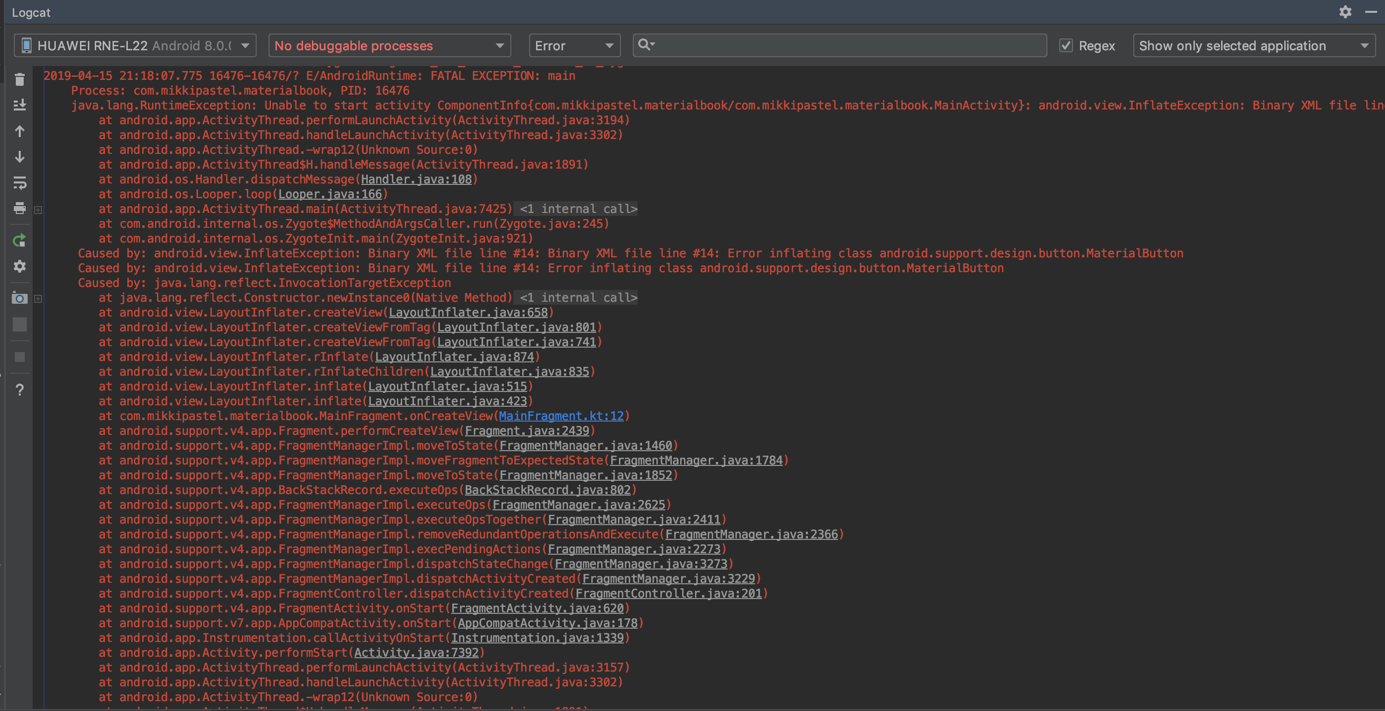
If you don’t change the theme, application will crash saying it can’t find Material Component
5. add Material Component to your app
Reference:

What’s Material Components are we going to focus on next? Let’s see on my next blog post for to be continue.
Follow my page and stay up-to-date
อย่าลืมกด like กด share บทความกันด้วยนะคะ :)
Posted by MikkiPastel on Sunday, December 10, 2017


